How to Create an Eye-catching Display Scheme for Beauty and Personal Care Storefronts
By Shenzhen Topwon Group Co.,Ltd
Jun 22, 2026
1. Why Storefront Window Displays Determine Your Foot Traffic
I’ve worked with local and overseas beauty brands on storefront display upgrades for over a decade, covering downtown high-street boutiques and small community cosmetic shops alike. One thing I’ve noticed repeatedly is how easily small beauty retailers lose sidewalk foot traffic, simply because their front-window displays look messy and unpolished. A lot of first-time shop owners spend most of their startup budget stocking high-priced skincare and makeup inventory, but pay almost no attention to roadside window styling. They fail to realize one simple truth: a well-organized storefront display acts as the first silent salesperson, catching the attention of random pedestrians strolling past on sidewalks. Creating attractive beauty retail displays does not require costly luxury decor at all. It hinges on proper color matching, life-based product grouping, tailored POP layout, and timely seasonal adjustments, all tailored to the spending habits of nearby local shoppers.
2. Color Matching: The Foundation of Attractive Cosmetic Window Design
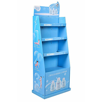
I always tell retail clients that color matching is the most basic yet decisive part of beauty window design. Unlike electronics stores that stick to plain neutral metallic tones, cosmetic retail needs soft, identifiable color schemes that align with brand positioning and seasonal trends. Shops focused on natural plant-based skincare often adopt sage green and creamy beige as main wall and backdrop tones, taking design inspiration from Innisfree’s classic nature-themed store style. Adding small potted foliage along window edges helps highlight the plant-derived ingredients used in facial creams and body moisturizers, letting customers feel the organic product positioning at a glance.
For makeup shops targeting young female passersby, warm pink, coral and soft lavender work best to match the hue of lipsticks, blushes and eyeshadow palettes. Last spring, I helped a neighborhood cosmetic store revamp its outdated gray window backdrop into warm peach. The change cost little, yet the shop saw nearly 30 percent growth in daily walk-in customers within just two weeks, thanks to better roadside visual appeal. One practical rule I always share with shop designers: keep core window colors within three tones maximum. Too many mixed shades create cluttered visuals, and will make casual pedestrians confused and unwilling to stop browsing.
3. Scenario-Based Product Grouping to Connect With Shoppers
Scenario-based product grouping is what separates top-performing beauty shops from average peers on the same shopping block. Most amateur retailers randomly stack skincare, makeup and body care goods inside glass windows, which looks disordered and fails to resonate with buyers. Instead, merchants should build tiny real-life usage scenes that fit consumers’ daily skincare routines. For summer window displays, retailers can group sunscreen, after-sun soothing gel, portable facial mist and waterproof cosmetics into a complete outdoor travel skincare set, matched with mini beach hats and shell decorations to set off the summer vibe. When dry autumn weather arrives, window displays shift focus to hydrating serums, rich body butter and barrier-repair face masks, paired with soft wool ornaments to fit dry-skin care demands.
4. Reasonable POP & Lightweight Display Fixture Arrangement
Reasonably arranged POP signage and movable lightweight display fixtures also matter for sustained roadside attraction. Vertical hanging POP banners above windows work great to highlight limited promotions, such as buy-one-get-one deals on daily facial cleansers. Small tabletop POP cards placed beside featured goods can mark key selling points clearly, for instance fragrance-free formulas suitable for sensitive skin. Lightweight acrylic freestanding racks placed right at shop entrances hold trial-size skincare and makeup samples, letting passersby test lotion texture and scent without stepping fully into the store. I always remind store staff to wipe down POP posters and display racks every two days. Dust-covered, faded promotional materials ruin the delicate, clean brand image of beauty products easily, leaving a bad first impression on potential buyers.
5. Timely Seasonal Display Updates to Avoid Visual Fatigue
Regular display updates are necessary to avoid aesthetic fatigue for regular local customers. I suggest local beauty retailers refresh at least one third of window layouts every month, and fully upgrade display themes for major festivals and seasonal transitions. Light summer skincare sets will be replaced with nourishing body cream and moisturizing lip balm displays in winter, matched with fuzzy fur decor and warm candle ornaments. When the back-to-school season comes, compact travel-sized skincare kits become the window focus, catering to student groups living and shopping nearby.
6. Final Summary: Low-Cost Window Display Tips to Boost Store Revenue
Overall, a competitive beauty storefront display balances harmonious color design, user-oriented scene layout and flexible promotional fixture setup. Shop owners do not need high-cost renovation to boost walk-in volume. Minor, customer-oriented tweaks based on real shopper feedback can turn casual roadside glances into actual purchases. In the crowded community beauty retail industry, refined storefront display is the easiest way to gain local exposure and build long-term stable customer loyalty.
Previous Article
Retail Floor Display in New York: TOPWON Display Rack Project Industry Analysis
Next Article
Retail display collection aspect

Trusted by These Featured Clients